Something like 10 years ago, when I was at the University of Maine working on my Computer Science degree, I took a course titled Graphical User Interface Design with Professor Charles Welty. There was probably one thing above all things that stuck with me from this course. It immediately impressed upon my mind the divide that existing between the developer and the client. When we are developing a user interface for our clients, we already have a vision of what it is and how it should work… but our clients do not have this knowledge. What we think is completely usable and straight-forward brings with it the bias of knowledge. Our clients do not have this bias and therefore might not immediately know how to use the system, at least not until they are instructed. Of course to close this divide a developer needs to be able to step back and try to forget what they know, in order to create something that is usable to someone who knows nothing.
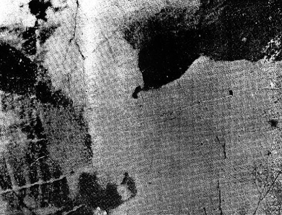
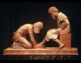
This was the simple example Professor Welty gave us… this is what your users see when they use your product. Can you tell what it is? (click the image to reveal)

Once you have seen the image for what it really is, you will probably never be able to “unsee” it. In other words, when you are developing a system for other users, something that may be completely obvious to you, may look like a Rorschach Test to your users.
According to Professor Welty, this example originally came from Professor Bill Ogden at New Mexico State University (hat tip).

